






Warm and Cool Colors: What’s the Difference?
September 21, 2026 Explore Blogs
Have you ever looked at a painting and instinctively felt like part of it was glowing while another part felt distant and calm? That reaction isn’t an accident—it’s color temperature at work. Understanding warm colors and cool colors, and knowing how to use warm and cool colors together, is one of the most fundamental skills in art, design, and even everyday decisions like choosing paper or packaging. This guide breaks down the warm color definition in art, the cool color definition, and how artists put both to work.
What Are Warm Colors?
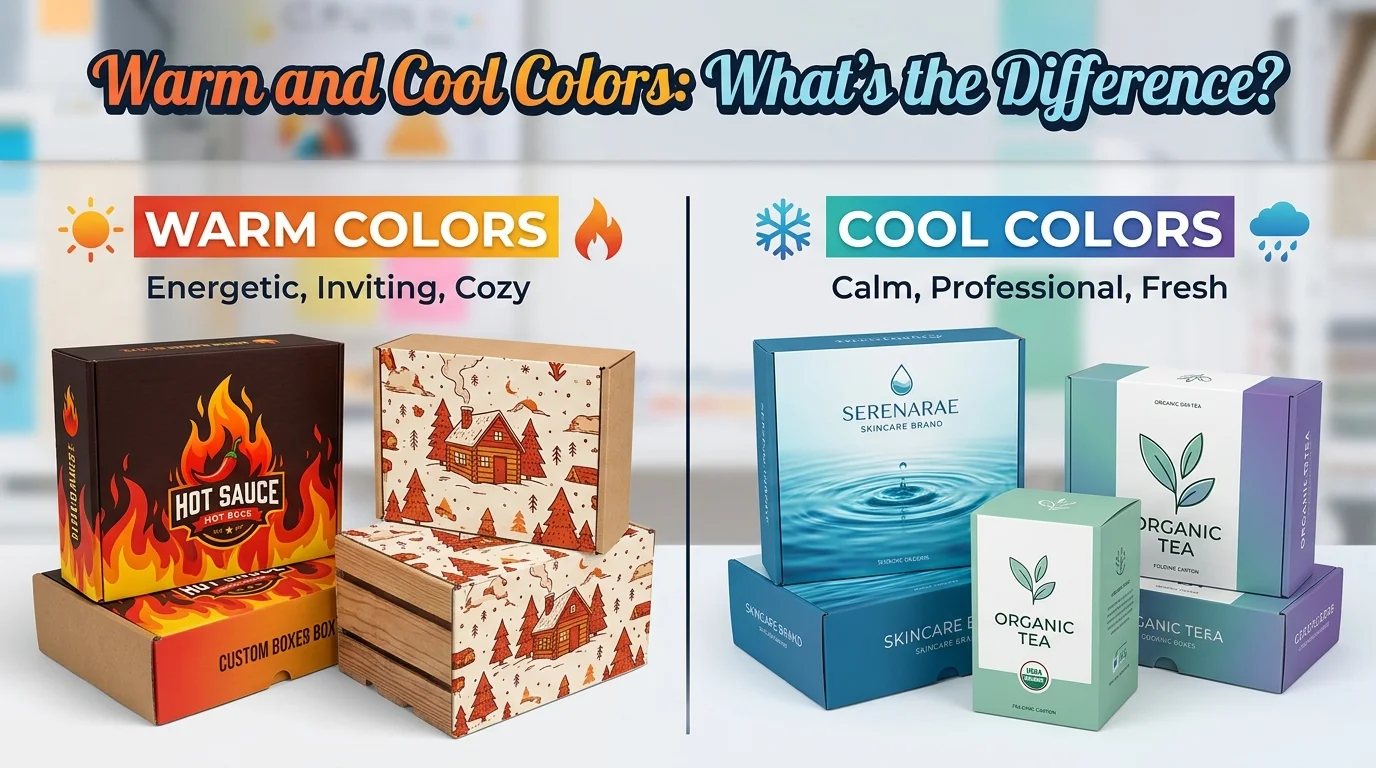
The warm color definition in art centers on three hues: red, orange, and yellow. These colors are associated with heat, sunlight, and fire, which is exactly why they trigger a cozy, energetic feeling the moment they enter a composition. Beyond comfort, warm tones are also linked to stronger emotions like passion, urgency, anger, and desire, depending on how they’re applied.
Warm colors also carry a practical advantage for artists and designers: they naturally draw the eye. Because they read as more vibrant and attention-grabbing than cooler hues, warm colors are frequently used to establish a focal point, guiding the viewer to the exact spot in an image where the artist wants attention to land.
What Are Cool Colors?
The cool colors definition covers blue, green, and purple hues tied to water, sky, and foliage. Unlike the singular energetic pull of warm colors, cool tones carry a more layered emotional range. They can express calmness, serenity, and stability, but depending on context and saturation, they can also read as melancholy or somber.
In visual art, cool colors are the go-to choice for backgrounds. Because they tend to visually recede rather than advance, placing cool hues behind a subject creates a sense of depth and distance, making the rest of the composition feel closer and more immediate by comparison.
Warm and Cool Colors on the Color Wheel
The color wheel is the tool that makes warm and cool colors easy to compare at a glance. It’s a circular chart that arranges every hue by color temperature, moving gradually from the warmest reds and oranges to the coolest blues and violets.
Two key relationships come out of this arrangement:
- Colors directly opposite each other on the wheel create strong contrast when paired, which is why complementary combinations like orange and blue feel so visually striking.
- Colors positioned next to each other blend harmoniously, producing a softer, more cohesive palette.
The wheel itself breaks down into three color categories that help explain how warm and cool tones are built:
- Primary colors — red, blue, and yellow. These can’t be created by mixing other colors; every other hue is derived from them.
- Secondary colors — green, orange, and purple, each formed by combining two primary colors.
- Tertiary colors — created by blending one primary and one adjacent secondary color, such as red-orange or blue-green.
As you move around the wheel, these colors shift gradually from warm to cool, which is why the color wheel remains the standard reference for building intentional, well-balanced palettes.
How Artists Use Warm and Cool Colors
Knowing the definitions is only half the story — the real skill is in application. Here’s how warm and cool colors get put to work in real compositions.
Use Warm Colors to Create Emphasis
Because warm tones naturally attract the eye, they’re ideal for highlighting a composition’s focal point. A painter working on a garden scene, for example, might use reds and oranges on the central flowers so they pop against a cooler green backdrop.
Use Cool Colors to Suggest Distance
Cool colors are the natural choice for anything meant to feel far away. Distant mountains rendered in blues and purples, for instance, create an illusion of depth known as atmospheric perspective a technique that makes far-off elements look softer and less distinct than what’s in the foreground.
Combine Both for Contrast
Pairing warm and cool colors is one of the most effective ways to add visual energy to a piece. A warm sunset in yellows and oranges becomes far more vivid against a cool blue sky because the cool tone pushes the warm tone forward and intensifies it. If a composition leans heavily toward one temperature, introducing a touch of the other almost always strengthens the overall balance.
Understand Relative Color Temperature
Color temperature isn’t always fixed; it’s relative to whatever sits nearby. A hue like red-violet can appear cooler when placed next to red but warmer when placed next to blue. This means warm and cool aren’t rigid categories; a color’s temperature can shift depending on its surroundings, giving artists more flexibility than the basic color wheel might suggest.
Apply Color Psychology
Because warm and cool colors carry distinct emotional associations, they’re powerful tools for storytelling. Warm palettes tend to evoke happiness and energy, while cool palettes lean toward calm or reflective moods. This principle isn’t limited to fine art — it also plays a role in design fields like branding and packaging, where color choices directly shape how a viewer feels about a product before they read a single word.
Stick to a Limited Palette
A tightly controlled selection of warm and cool colors often produces a more polished, unified result than a wide, scattered range of hues. Limiting the palette forces stronger relationships between the colors that are used, sharpening the composition’s mood and making the piece feel more intentional overall.
Final Thoughts
Warm and cool colors aren’t just an art-class concept; they’re a practical framework for controlling focus, mood, and depth in any visual project. Once you understand the warm colors definition in art and the cool colors definition, and how the color wheel connects them, choosing a palette becomes far less like guesswork and much more like a deliberate creative decision.
Ready to bring your color palette to life on paper? Custom Printed Paper offers premium stock in a wide range of tones and finishes to match any warm or cool design vision. Explore our collection today and print your next project in true color.
Also Read: Shipping Box Sizes: A Complete Guide to Standard Dimensions